Case Study

DripLo

Case study documenting the processes and procedures used for my final Capstone Project in MICA’s UX Design graduate program.

The product I created takes a stand against fast fashion, connecting users with second-hand clothing vendors and stores in their local area.

THE PROBLEM

Fast fashion is affordable, but it’s not sustainable.

Shopping for second-hand clothing has unique challenges. How might we improve the experience of second-hand shopping so that it’s easier for the user, and is kinder on the environment?

“The growing number of deliveries arriving in cardboard boxes, plastic bags and other packaging has raised an alarm that online shopping leads to more waste.” Source

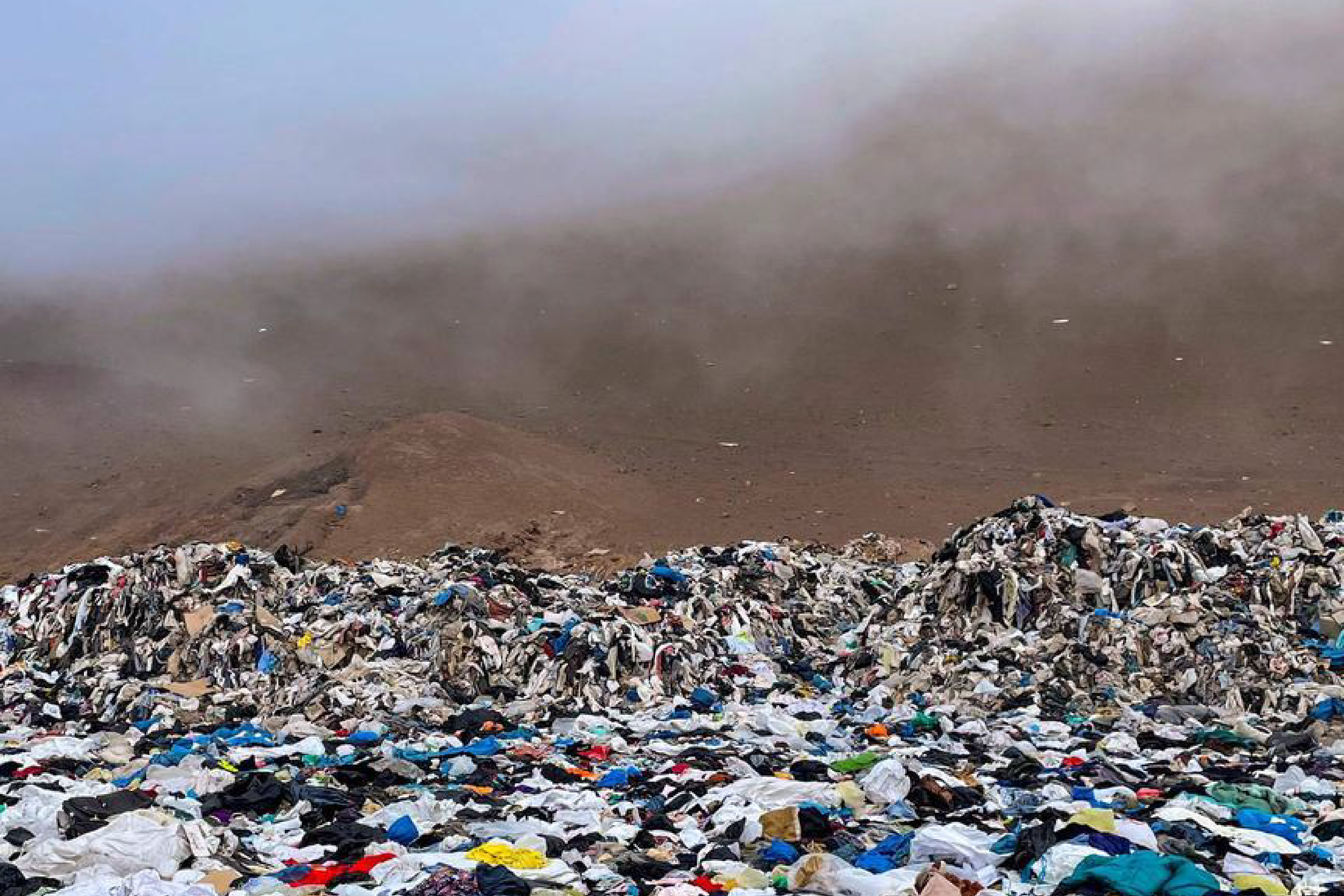
Chile’s Atacama Desert is a dumping ground for thousands of tons of used and unsold articles of clothing. Source

“The fashion industry is currently responsible for more annual carbon emissions than all international flights and maritime shipping combined.” Source

More shipping, more problems

An increase in online shopping during the COVID-19 pandemic has created more waste from cardboard and shipping supplies.

Think globally, act locally

Shopping small and supporting independent business owners is an investment into your local economy.

One person's trash is another person's treasure

Shopping second-hand presents opportunities for unique individual style that's missing from mass manufactured fast fashion.

Context + Research

Macro Force Assessment

By looking at external forces that are at play in the second-hand fashion space, I was able to identify opportunities for innovation.

Of the 6 macro forces, I found that 5 of them play a role or present opportunities in the second-hand fashion space (all except Political). Early on in this project, this served as confirmation that this was a valid topic to explore, with plenty of room for innovation and iteration.

Gen Z & Millennials are more financially conscious than older generations, and more likely to buy second-hand

Increased awareness of climate change provides an opportunity to encourage more sustainable shopping habits to the conscious consumer

Nostalgic fashion trends (such as #y2k) drive interest in second-hand sales, but can also lead to inflated prices.

Opportunity to reach socially conscious shoppers that care less about trends and more about their own individualistic style

Opportunity to integrate with tools that users and stakeholders (second-hand sellers / stores) are already using, like social media

Competitive Analysis

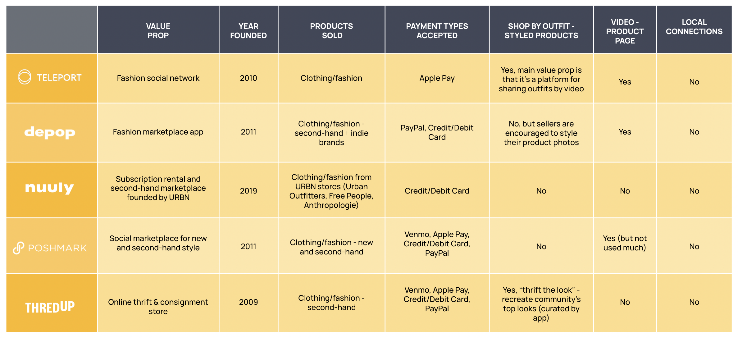
By comparing features of 5 products in the second-hand ecommerce space and compiling those findings into a matrix, I was able to identify opportunities and get a clearer picture of the space as a whole.

KEY INSIGHT

Shop Locally

None of the products that I looked at have a way to connect or shop with sellers in the user’s local area. Local second-hand shopping is typically done through classified-type products, such as Craigslist and Facebook Marketplace.

Opportunity
Create a richer shopping experience for curated second-hand items.

KEY INSIGHT

Showcase Thrift Culture for Locals and Tourists

My research indicates that most people who like to shop second-hand have visited a thrift store in another city while traveling, and none of these products facilitate discovering stores in a city that users are unfamiliar with.  Is there a way that we could show off what makes each city’s “thrift scene” unique?

Opportunity
Create a product that can be used by people locally when they’re home AND when they’re traveling.

Comparative Analysis

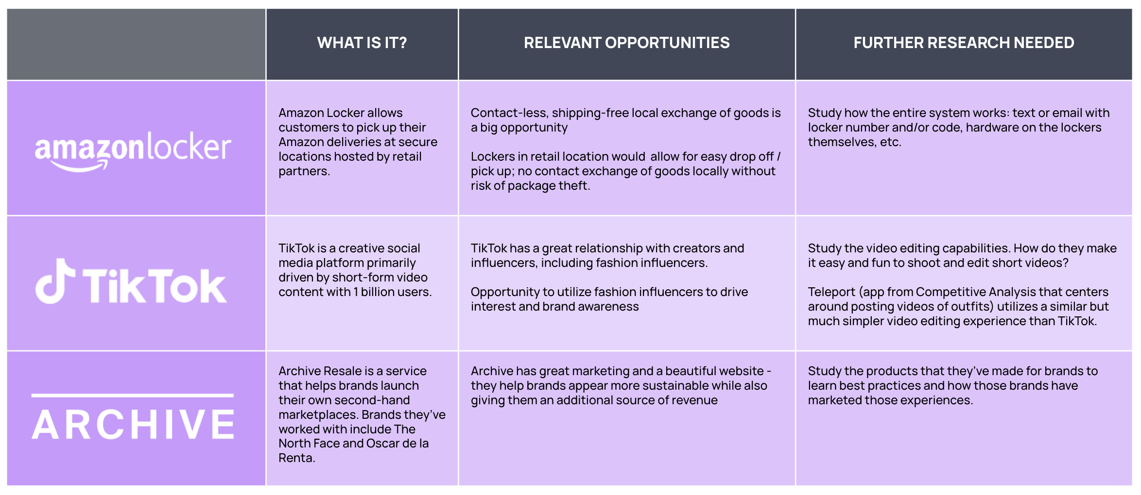
The comparative analysis was a chance to study features and flows that aren’t typically included in second-hand ecommerce competitor products, and identify potential areas that could use more research.

KEY INSIGHT

Video Content

Leaders in the fashion industry have been rapidly incorporating video and AR into their ecommerce experiences. TikTok offers UX patterns that users are familiar with, and video could potentially give shoppers more information about the things they’re shopping for.

Opportunity
Create a richer shopping experience for curated second-hand items.

KEY INSIGHT

Self-Service Lockers

Right now, I don’t think this product will facilitate actual purchases, but it certainly could be expanded to include purchases as part of the experience in the future. A self-service locker/delivery system like Amazon Locker would be a departure from other second-hand ecommerce experiences.

Opportunity
When/if purchases are included, research how users feel about self-service lockers for local pickup.

User Survey

The purpose of this survey was to gather quantitative insights about second-hand shopping habits and motivations. I was able to get a good sample size of responses by posting the survey to a Reddit sub dedicated to thrifting.

KEY INSIGHT #1

Thrifting While Traveling

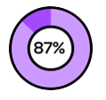
87% of survey participants have visited a second- hand store while traveling

KEY INSIGHT #2

In Search of Treasures

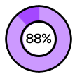
88% of survey participants said that finding unique or interesting items is a reason they shop second-hand

KEY INSIGHT #3

Social Media has Potential

10% of participants follow second- hand sellers on social media AND have purchased something that they saw posted

33% of participants follow second- hand sellers on social media but have never made a purchase. This means they are engaging with the content that sellers are posting, which is a big opportunity.

User Interviews

The purpose of user interviews is to gather qualitative insights about pain points and successes that users experience while shopping second-hand. Participants ranged from age 20 to 47, and they all have purchased something second-hand in the past year.

KEY INSIGHT #1

Thrifting as a Leisure or Social Activity

Multiple interview participants indicated that second-hand shopping isn’t something they do out of necessity; it’s something they do for fun, often with friends or family.

INTERVIEW QUOTE
“For me, it’s all about finding things that are interesting, and seeing things you never would otherwise.”
KEY INSIGHT #2

Multiple Stores per Trip

All four participants said that they often visit multiple stores on a second-hand shopping trip. Shopping second-hand isn’t the most efficient way to shop, and people are ok with that.

INTERVIEW QUOTE
“[Second-hand shopping] takes patience and time. If you rush, you’ll miss all the best things.”
KEY INSIGHT #3

Benefits to Shopping In-Person

All four participants have used ecommerce apps (Poshmark, ThredUp, or Depop) before, but they all indicated that second-hand shopping in person has distinct benefits, such as avoiding shipping costs, accurately seeing the condition of the item, and having the ability to try things on before purchasing.

INTERVIEW QUOTE
“Sometimes the condition of things is overstated by sellers online. I like being able to see and touch things for myself.”

Insights

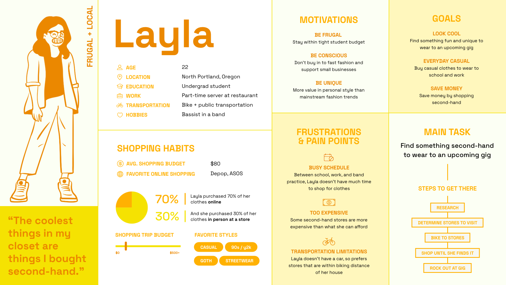
Personas & User Journeys

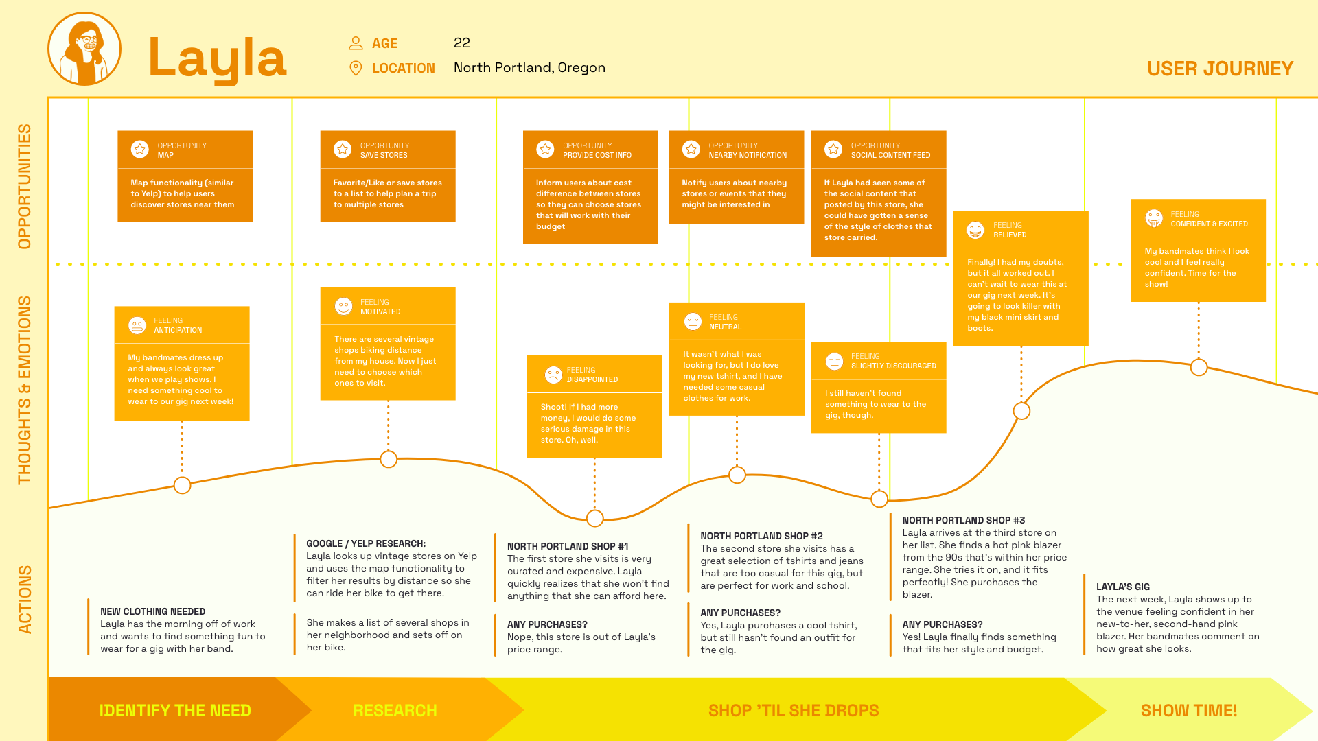
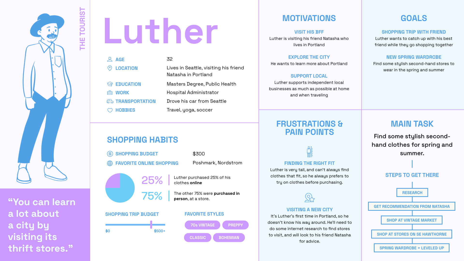
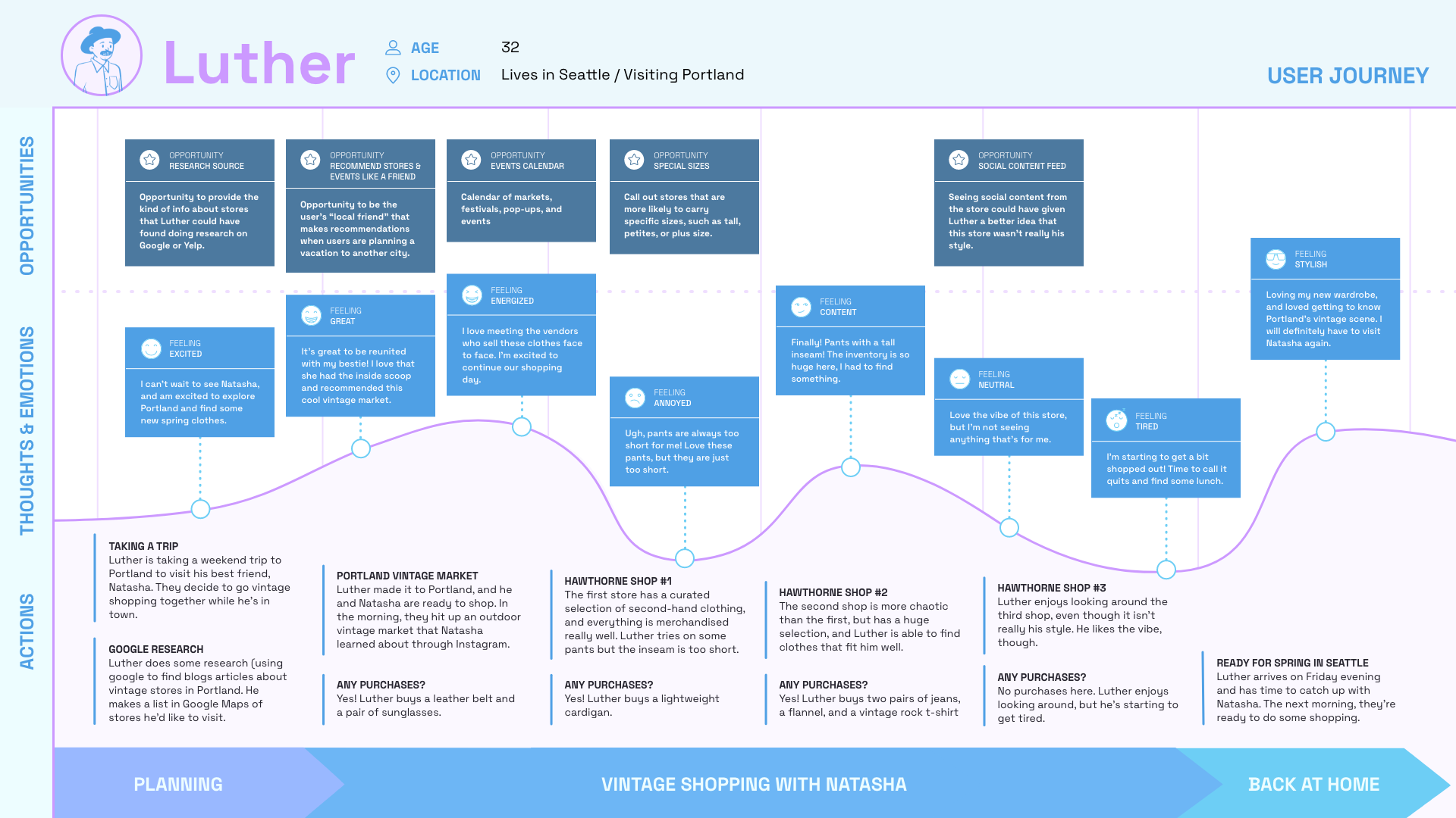
Using insights and findings from my survey and user interviews, I created two personas and accompanying user journey maps that follow each persona on a shopping trip.

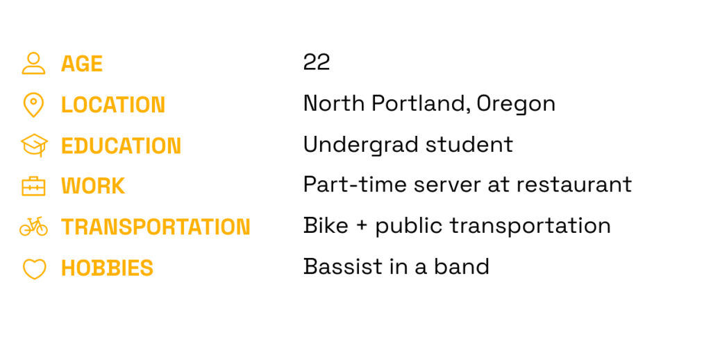
PERSONA 1

Layla

Frugal & Local

LAYLA'S MAIN TASK

Find something to wear to an upcoming gig she has with her band

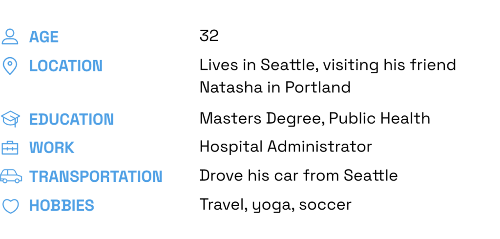
PERSONA 2

Luther

The Tourist

LUTHER'S MAIN TASK

Find stylish second-hand clothes for spring & summer while visiting his friend Natasha

Concept

PRODUCT CONCEPT

DripLo is a platform for shoppers to discover local independent second-hand clothing stores and boutiques.

DripLo helps shoppers manage the unique challenges they face when shopping for second-hand clothing.

TWO MAIN USER GROUPS

Shoppers

So far my research has focused only on shoppers and their experience.

Sellers / Stores

For the sake of scope and timing, I have not conducted research yet on the needs of second-hand sellers, but talking directly to sellers is an important next step that will inform future iterations of DripLo.

WHAT'S WITH THE NAME?

Drip

Urban dictionary definition: A cool & stylish outfit

+

Lo

Lo = local

Low / Mid-Fidelity Wireframes

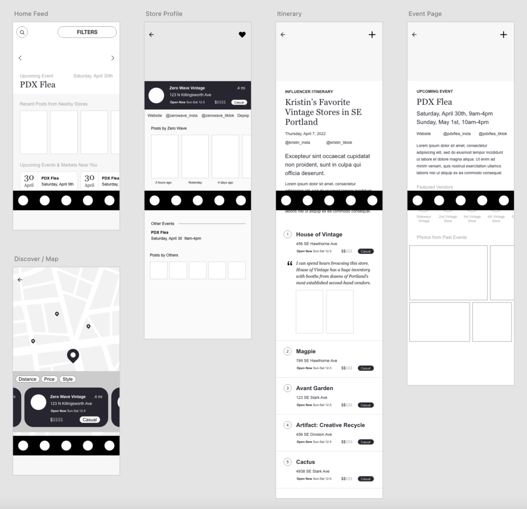
The purpose of these wireframes was to build the initial UX framework for this product that will be used later to create a high-fidelity working prototype.

UX PATTERN INSPIRATION

For store discovery by location, I looked to Yelp and their map functionality. I also studied their Collections feature as a relevant example for the Itinerary feature that I want to include.

For video content, I looked to Instagram Reels and TikTok. TikTok currently has over 700 million users worldwide, so it’s safe to say that their UX patterns are familiar for many users, and these patterns have been adopted by Instagram Reels as well.

Yelp

Instagram Reels

TikTok

Branding & Design System

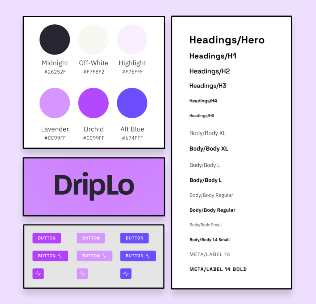
Next, I created a design system for DripLo that included a logo, typography system, color palette, and basic components to be used in the high-fidelity working prototype.

BRAND IDENTITY

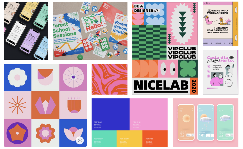
Given the popularity of second-hand shopping with Millennials and Zoomers, it was important that DripLo’s branding feel young, contemporary and vibrant. To kick off the branding process, I created a mood board (below) to inform marketing and UI.

Design + Test

High-Fidelity Prototype + Iteration from User Testing

USER TESTING

Once it was finally time for  prototyping, I was excited to dive into Figma and apply my findings thus far, then iterate based on testing insights.

I had a list of features and flows that I was interested in exploring and limited time to pursue them, so I narrowed that list down using the opportunities that I had found in user journey maps. I added the other features to my Next Steps to explore in the future.

OPPORTUNITY 1: LEVERAGE VIDEO CONTENT FROM SOCIAL MEDIA

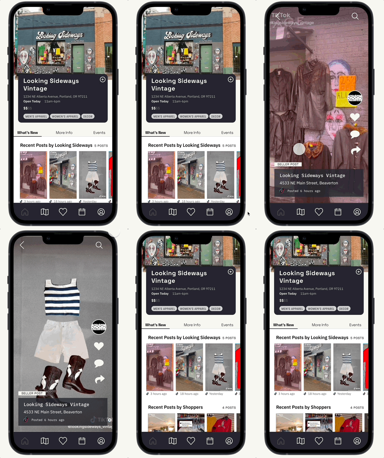
Social Feed of Recent Videos by Local Second-Hand Sellers

A second-hand store is as good as their inventory right now.

Many sellers already use TikTok & Instagram Reels to give their followers an idea of what’s in the store at any given time. Importing that content while it’s relevant gives users a real-time look at their favorite stores.

INSIGHT FROM USER TESTING

Video Swiping = Successful

I wanted to validate that users understood how to use the TikTok video swiping UX pattern, and aren’t overwhelmed by the inclusion of full-screen videos, so I had users complete a task that involved swiping through video content.

5 out of 5 people said they “loved” the experience of swiping through videos

5 out of 6 people said they knew to swipe up to navigate through video content

OPPORTUNITY 2: PLAN A MULTI-STORE SHOPPING TRIP

User-Created Shopping Itineraries

Second-hand shopping often involves multiple stores. 

Shoppers can plan a second-hand shopping trip by adding stores to personal itineraries, and add notes about their favorite stores. Yelp’s UX pattern for Collections was an inspiration for this feature, with the addition of recent video content for stores that have recently posted to social media.

INSIGHT FROM USER TESTING

Heart Iconography = Not So Clear

In my initial prototype design, a heart icon was used to indicate adding a store to an itinerary. When users were asked if it was clear that they were supposed to use the heart icon to add a store to an itinerary, users were split – 2 said yes, 3 said no.

For this reason, I changed the iconography from a heart to a plus sign for the time being, but since the split was so close, I would like to spend more time testing different iconography to validate the plus, and potentially test other iterations of this icon.

PERSONA CHECK-IN

Layla

Layla uses itineraries to keep a running list of her favorite vintage stores in her neighborhood that are close enough that she can get there by bike.

PERSONA CHECK-IN

Luther

Before his trip, Luther uses itineraries to save stores that he’s interested in.

OPPORTUNITY 3: PLAN A MULTI-STORE SHOPPING TRIP

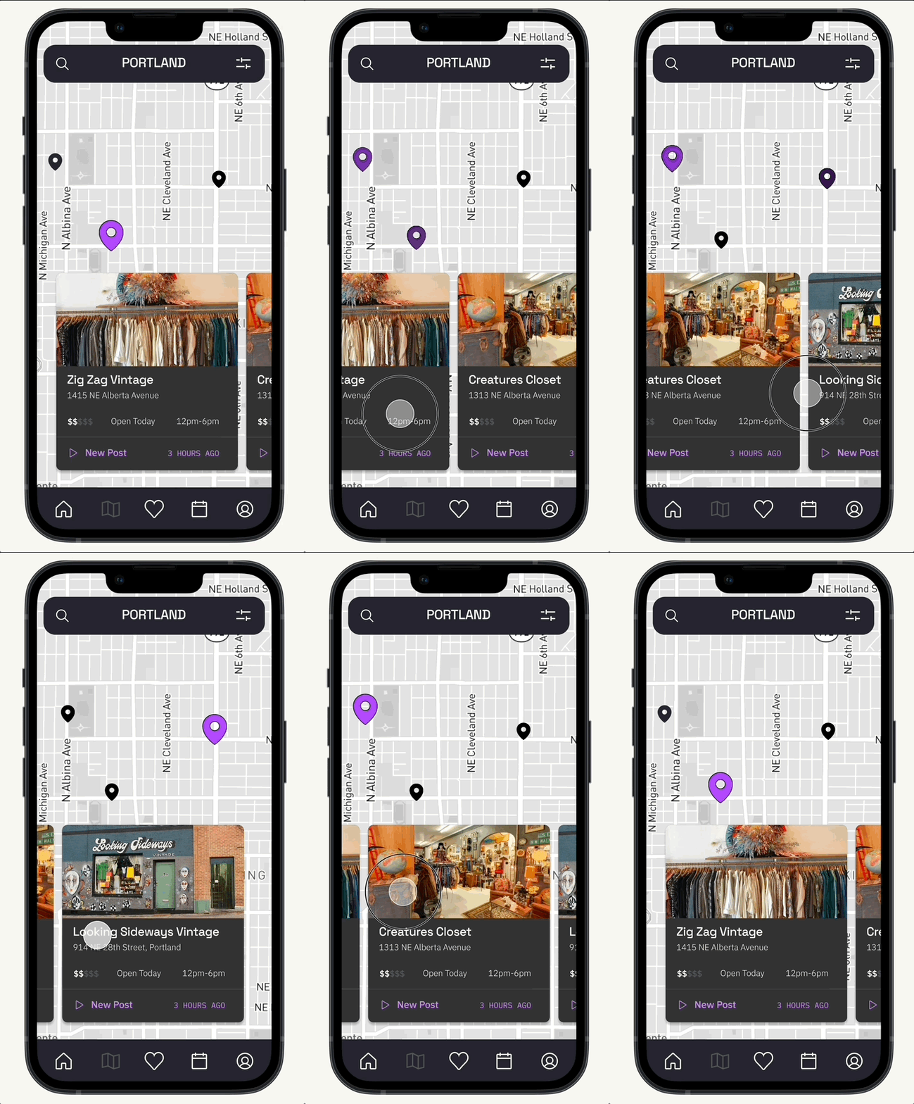
Map Search Functionality for Store Discovery

Finding nearby stores is helpful to both tourists and locals.

Filters give users the ability to narrow down their results and find stores by budget or distance.

INSIGHT FROM USER TESTING

Map Swiping = Successful​

I wanted to validate that users understood the interaction and microinteractions when swiping through stores on a map.

6 out of 6 users said that it was at least somewhat easy to find a store by horizontally swiping (following a UX pattern made popular by Yelp) on the Discover/Map screen.

PERSONA CHECK-IN

Layla

Transportation is a pain point for Layla, so she uses the map to find stores that are in her direct neighborhood

PERSONA CHECK-IN

Luther

Luther is planning a trip in a city he’s unfamiliar with; a map helps him find stores that are in the same area to reduce the amount of driving he’ll have to do.

Wrap Up

Learnings and Personal Insights

I learned so much about the product design process throughout this project and throughout the MPS in UX Design program at MICA, and I also learned about my own personal work style.

SCOPE CREEP IS REAL

Respect the scope!

During both the research and design processes, I found that it was very easy to get distracted and excited about possibilities and opportunities that fall outside of the scope. That being said, I learned that revisiting the scope often helps confirm that priorities are correct and workload is moving in the right direction.

RESEARCH & STRATEGY

Finding my place in the industry

When I started the MPS UX Design program at MICA, I assumed I would gravitate towards UI and visual design, since my background is in graphic design. In this project though, I was most enthusiastic about the research and strategy part of the process.

I’ve used Adobe XD a lot, but I chose to use Figma for prototyping on this project. I was less efficient than I would have been using XD, but I learned so much about Figma’s prototyping capabilities, and I’m excited to use it more in the future.

TREASURED ADVICE

Have a reason for everything you do

A guest speaker in an earlier course was asked to give parting advice about working in UX Design, and her response was, “Have a reason for everything you do.” 

This project taught me that there’s a lot of flexibility within the both the product research and design processes, as long as you can confidently explain why you approached it that way. UX Design is both an art and a science, and creative ideas can be pursued as long as that choice can be backed up with data or insights.

Next Steps

I’m proud of what I’ve accomplished with this project, but there are many other things I would want to do to fully pursue the concept and consider the entire audience.

MORE RESEARCH NEEDED

Research seller user needs

To get a full picture of both user groups, I will need to talk with second-hand sellers. By learning what their personal pain points are, I’ll gain insights to inform  how I could iterate on DripLo’s current features with those needs in mind, and what new features could be added to support this user group.

VISUALLY POLISH

Clean up product User Interface

The Aesthetic Usability Effect states that users perceive beautiful products to be more usable. Creating beautiful UI takes a lot of time, and I didn’t have as much time as I wanted to focus solely on DripLo’s UI and visual design. I think there are some things I could do to improve the look & feel of the product and make the experience overall feel more professional.

OUTER SCOPE

Explore features and flows that were out of scope

  • Curated itineraries and collaboration with influencers

  • Event calendar + notify users about upcoming vintage events

  • “Post your haul” – encourage users to post content about their purchases and tag where they bought them

Thank You!

Thanks for taking the time to read about my experience with DripLo!
Shoot me an email at [email protected] with any feedback, questions or comments.